Date
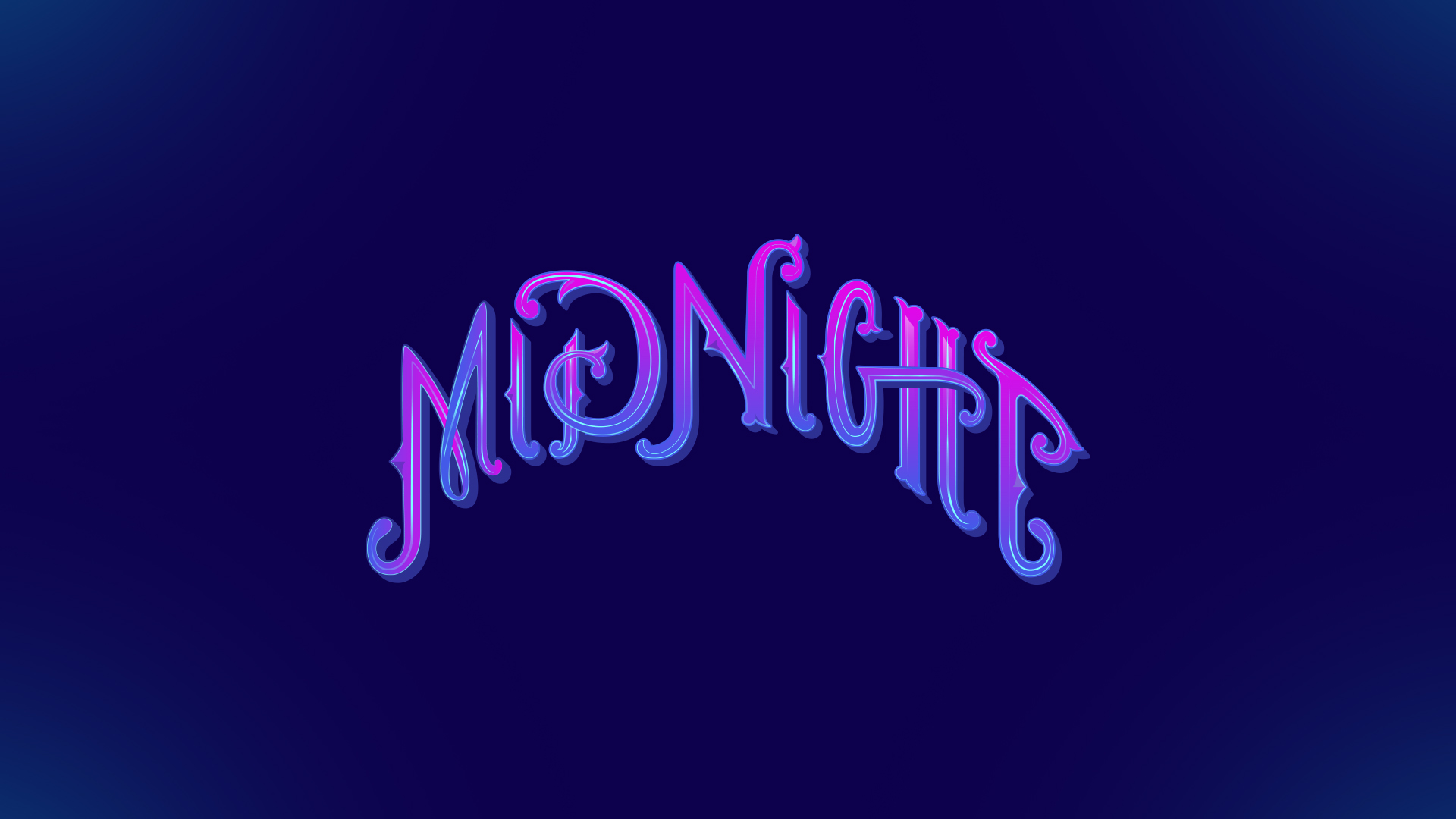
This design is the beginning of a logo concept that I ended up scrapping. I shared this on my Dribbble earlier today and thought I’d share here too. I love the interactions between the letters, the creation of ligatures, by dotting the ‘i’ with the top of the ‘d’ and crossing the ‘h’ with the ‘g’ crossbar. I wish it would have fit the format of the project it was intended for, but I got a little overzealous in its arching shape and it just couldn’t work.
As an artist and designer it’s hard for me to share my creative process. It’s ironic, since I find other creative’s process a source of great inspiration. But then I look at my own sketches and test paintings and I just feel embarrassment. I’m going to make a conscious effort in overcoming this though, because as I put together this website, I realized I’ve kept a lot of work under lock and key because of my insecurities. And as a result it just looks like I am not being as creative as I truly am. So here’s to more inclusion in every step of the creative process. Cheers.
Head over to my Dribbble where I share more process work and work that’s left on the cutting room floor like this lettering design.


No Comments